Talk about SyMenu or post suggestions, requests, or how-to questions
The reorganized SPS Manager
|
Gianluca Administrator Posts: 1382
29/03/2017
|
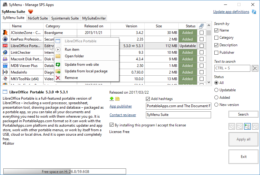
This is my study for a reorganized SPS Manager.

In my opinion this approach is cleaner than the current one and it should grant a better usability.
These are the main details.
The command to interact with a single program will be moved in a contextual menu along with the execute item and the open folder item. This way it's easier to understand which program is the target of every command. The contextual menu is dynamically created so you will find only the possible command for that particular program.
Without the big command buttons, the program details area becomes largest so you can see more information at once.
The Apply all button instead is always visible among the search filters and the Exit button. Today it appears only if you select a row in the list but this is a counter intuitive behavior because the Apply all is not related to a single program. Further it appears on the program details area that is not the right place for it because it is not related to the single program.
The search filters becomes always visible. I know that someone of you is not using the filters and hides them but the future SPS approach will be search rather than list.
My final plan is to merge the three suites and you'll have a list of more than 1.000 programs... it is not possible to scan a list of 1.000 elements so the search will be the your only chance to find something. Anyway when this happens, the filters will be changed too so don't worry about that.
That's all.
It's the first time I share a study for a future implementation with the community. It's an experiment and it means that I'm in the right mood to accept suggestions, criticism, or whatever you have to tell me. So feel free to share your ideas.
But guys, if this feature is accepted here, please don't complain when I released it 
|
|
|
link
|