|
Gianluca Administrator Posts: 1382
15/02/2016
|
It's time to publish some news about the next version.
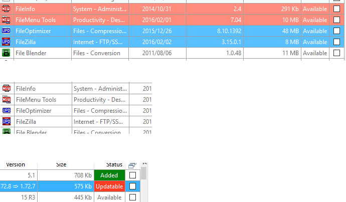
Besides the scripting engine I'm working on a new feature to recognize the SPS that are new from those ones that are simply updated.
In the image below you can find my first attempts.

I'm awaiting for your feedback.
|
|
|
link
|
|
VVV_Easy_Symenu Posts: 159
15/02/2016
|
  
Only one suggestion of appearance, all cases in same colour. For instance, UPD icon in deep blue, line in clear blue and Status "Available" in the clear blue but if "Updatable" in deep blue (not in red). More elegant?
edited by VVV_Easy_Symenu on 15/02/2016
|
|
|
link
|
|
sl23 Posts: 311
16/02/2016
|
I like it exactly how it's shown. Good job Gian.
|
|
|
link
|
|
timrray Posts: 24
16/02/2016
|
I like it as well. One thing I might suggest is a way to remove "new" from new ones you've seen the last time you looked. From one day to the next it's difficult to see when items are added that are truly new.
|
|
|
link
|
|
Gianluca Administrator Posts: 1382
16/02/2016
|
Hi guys.
The colors are only sketched and are not definitive. You can see two different solutions, one with the colorful background and one not. If someone wants to sketch something more nice and intuitive, be my guest.
I don't track the user access in the SPS Manager and for this reason I can't remove the new/updated attributes based on that. But I can shorten the period in which the new status is activated. Now we are on 11 days. I can go down to 5 or 7 days if you agree.
|
|
|
link
|
|
sl23 Posts: 311
17/02/2016
|
@timrray +1 but as apps aren't added at any great rate I don't see this being too much of a problem.
@Gian I do think 5 days is enough
|
|
|
link
|
|
Gianluca Administrator Posts: 1382
17/02/2016
|
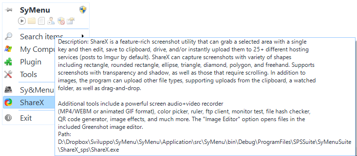
And here's the new tooltip 

|
|
|
link
|
|
sl23 Posts: 311
17/02/2016
|
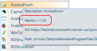
I would like version number and path only as tooltip, is that possible?
|
|
|
link
|
|
Gianluca Administrator Posts: 1382
18/02/2016
|
Every element you currently see in the tooltip is customizable.
For example today you can have the only path but I haven't thought to the version. I can add it as a new option.
|
|
|
link
|
|
sl23 Posts: 311
18/02/2016
|
That would be great, thanks. Lately I've wanted to check a few apps version numbers, as I have found useful on the PA.c menu from time to time. It is obviously easier to have a tooltip than keep opening the sps manager window.
|
|
|
link
|
|
Gianluca Administrator Posts: 1382
19/02/2016
|

|
|
|
link
|
|
sl23 Posts: 311
22/02/2016
|
Whoa! I missed that last post!
That's great Gian, thanks
|
|
|
link
|
|
sl23 Posts: 311
25/02/2016
|
One more thing regarding tooltips, specifically, Path. If a SyItem is located within the SyMenu/Program/Files folder, could the path be reduced to reflect that and just show from the suite folder and beyond? It would look tidier and be easier to read.
|
|
|
link
|
|
Gianluca Administrator Posts: 1382
27/02/2016
|
In that way we will have some full paths and some relative paths. It's not good for consistency.
Besides consider that you shouldn't know where the SyMenu is located. Think about a SyMenu located in a network path or in a pen drive that always changes its drive letter.
Again what if you have two SyMenu versions that work from different locations? I would know where exactly is any element inside the contextual menu I'm looking without making too many thoughts.
You are right about the relative paths, they are easier to read but they are prone to be misunderstood too.
|
|
|
link
|
|
sl23 Posts: 311
27/02/2016
|
Ok, I see your point.
|
|
|
link
|